‘The Children Yearn For Technicolour’: Why Films Look Dull Now
Words: Kitty Lloyd
Make it stand out
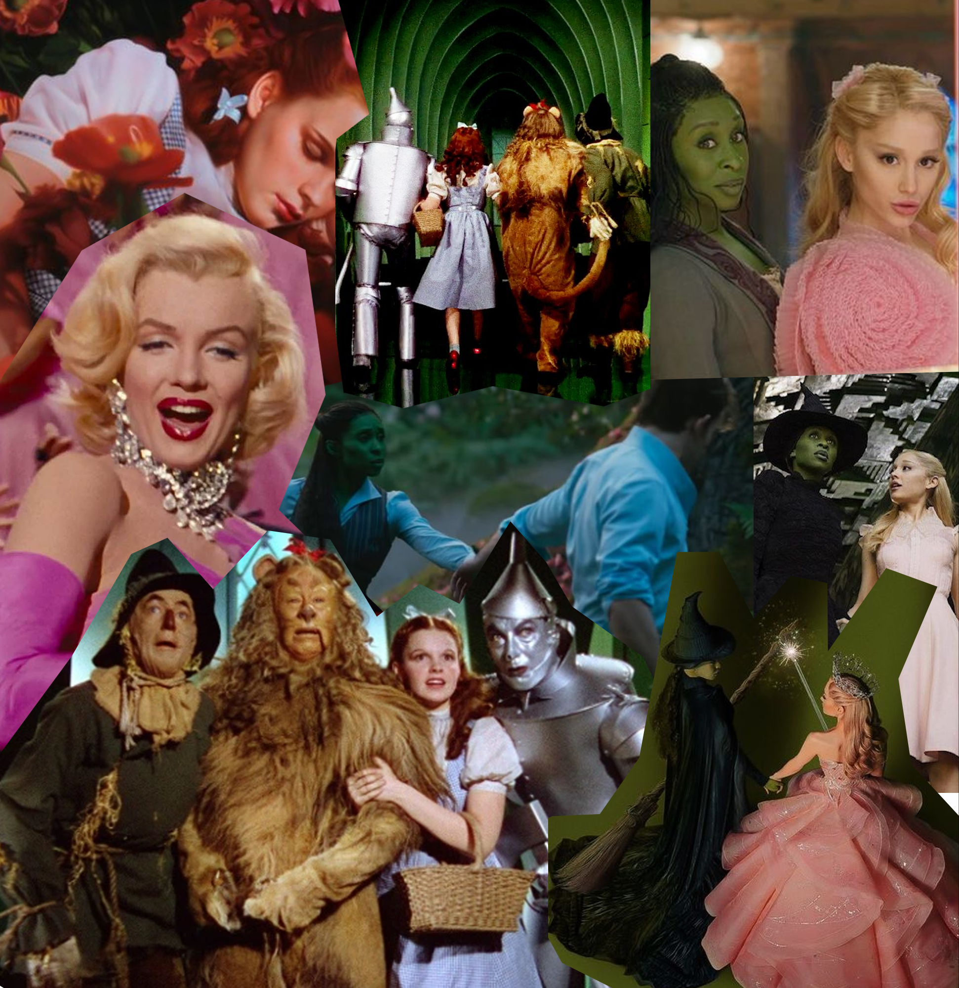
From the grey-scale hellscape of superhero movies to the lifeless first look at the Freaky Friday sequel, colour and its decline in film has become a viral source of concern. Most recently, a first look at the fiercely anticipated musical adaptation Wicked provoked outcry for its greige scenes, muted costuming and “nasty, unforgivable backlight.” As one user said, “We have strayed so far from God’s light,” comparing the iconic technicolour scenes of The Wizard of Oz to its lacklustre prequel.
A palpable nostalgia simmers for the pre-streamer days of movies as we grapple with the increasingly dull look of the art that has historically been such a vital source of escapism. As one user puts it: “The children yearn for technicolour”.
It’s no secret that much of today’s cinema leaves something to be desired. Designed to be experienced at home instead of the cinema, streamer-era film offers a strikingly different feel and experience to the movies that came before it. Whilst there are countless exceptions, a good majority of streamer flicks look undeniably bad, flat and just not-quite right.
___STEADY_PAYWALL___
Film Twitter (presently X) member Katie Stebbin defines this as: “intangible sludge”. That prosaic, uniform look that has you squinting to make out night scenes and underwhelmed at the narrative emotional highs. Kate first coined the term in response to the muddy-muted look of prestige 2010s television, however, ‘intangible sludge’ has managed to trickle down beyond this genre, overtaking the visuals of teen movies, rompy action flicks and beyond.
The grey-ification of movie appearances stems from numerous factors. The rise of digital cameras over film would serve to shoot extremely flat images, which would become detrimental when streaming rose to prominence. Practical effects declined and the dynamics of film production shifted to a more immediate and capital-focused model. Even the CGI looks worse than it used to. The result is often a visual look that just lacks the warmth, texture and authenticity that the past managed to master.
The examples of this phenomenon at work are endless. In the context of the aforementioned Freaky Friday sequel, fans were shocked at the first look, which depicted the mother-daughter duo with a soulless colour palette and garnered hundreds of replies asking: “Why are we afraid of saturation in movies now?”
While arguably, promotion materials tend to not receive the same colour correction as the final movie, fans would agree that this new chapter is a far cry from the warmth and life the original film gleamed. It wasn’t just a dip in the rose-tinted glasses of childhood, the Freaky Friday sequel imagery (so far) just served as a reminder that things really are bleak now. Literally.
“Throughout time, colour has always had an intimate connection to our emotional reality. In the context of art, this power becomes supercharged.”
Ultimately, colour and film’s relationship has been a cause of concern for generations. Before even the rise of digital cameras, a crisis over the fate of colour in film erupted in the late 70s when it was discovered that the film of classic pictures was unstable and prone to decay. Martin Scorsese spearheaded the campaign for a solution, with the auteur even going on to oversee the restoration of the iconic 1948 film The Red Shoes, his childhood favourite and a touchstone of technicolour.
For Scorsese, this wasn’t just a matter of historical preservation – it was the conservation of the emotional soul of the film. In his heart-warming essay penned for Encyclopedia of Britannia, Scorsese actually hits the crux of the crisis that film Twitter would face 50 or so years later. “The fact that the colour was lost, I realised that the performances were lost as well, and the characters along with them …” explained Scorsese. “Their emotional connections to each other and to the audience had been lost. They walked across the screen like phantoms. This meant that the entire narrative was lost. In essence, the film itself was lost.”
Throughout time, colour has always had an intimate connection to our emotional reality. In the context of art, this power becomes supercharged. From Yves Klein’s eponymous shade to the green-pink galore of Outkast’s Hey Ya music video and everything in between, colour has a profound ability to evoke feelings and impart nuanced meaning. Colour provides a valued mechanism to guide an audience emotionally through a film. And when it’s gone or shamelessly diluted, like in the case of Wicked’s initial promotion, the emotional capacity of the film is as well. The art that we expect to move us just ends up falling short.
That’s not to say ‘good’ films require bombastically hyper-saturated palettes – technicolour is, of course, lost. But from shadow-drenched film noirs to Lost in Translation (2005), films with minimal bright colours, but darkness and depth, still serve a purpose. It’s the muddy middle ground of not-quite blacks and not-quite colours that can deny film its full power.
If colour is crucial to the emotional core of a film, the children’s yearning for technicolour isn’t just a desire for high saturation. It’s a need for humanness, for depth, for purposeful coolness or an embracing warmth. It’s a craving for art to actually emotionally satiate in a way it once did.


