Beauty Archivist: McQueen '97
Make it stand out
It’s 1997 and you’re sitting cross legged on the floor of Borough Market, cig in hand. It's the 90’s, so think grim industrial space below some train tracks, not expensive groceries. It’s dark with a sort of malevolent red light that barely illuminates the faces of the people sitting next to you. The crowd is really rowdy and gate crashers have knocked through the metal barriers. The front row is fashion students and anyone that could push up front, both Gallagher brothers and Joan Collins are somewhere in the crush but the Harrods team turned up then left. You’re at Lee McQueen’s first show - under brand name Alexander McQueen - since his widely trashed debut with Givenchy.
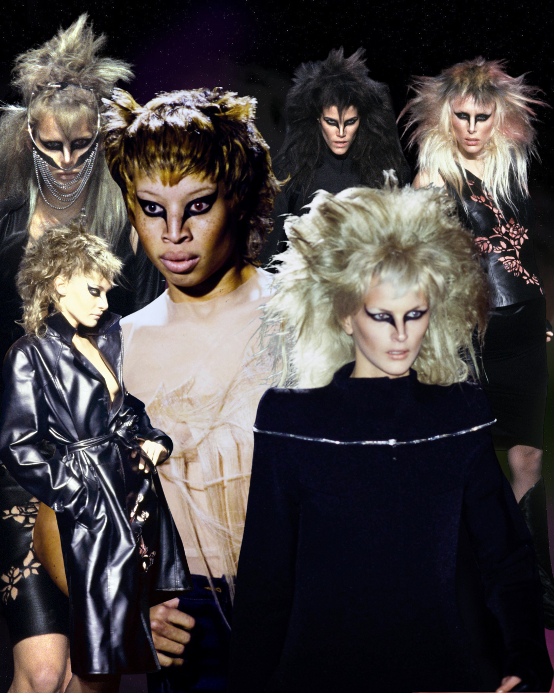
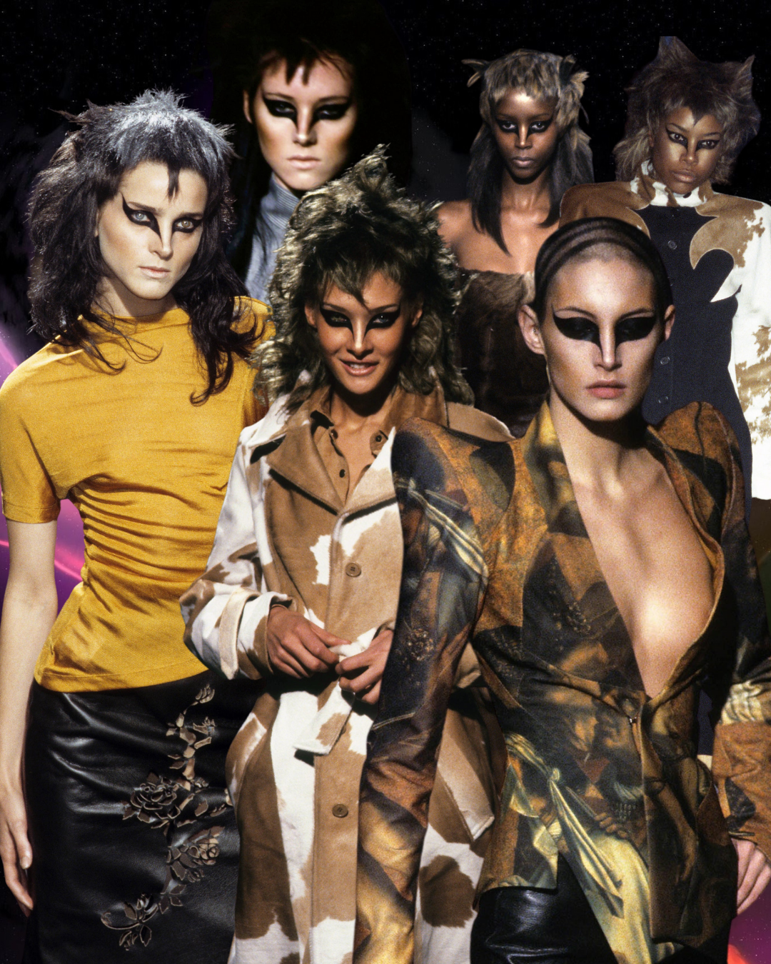
Stella Tennant opens the show, but it’s hard to tell it’s even her because of two deep slashes of eyeliner totally obscuring her optical bone, carving her temples and almost disfiguring her nose; pinching it into an entirely different proportion. Then Debra Shaw, her face also totally remodelled by the two dark shapes and one white contact lens.
The look is sexy but terrifying. “Fashion is a jungle full of nasty, bitchy hyenas.” McQueen said, “The whole show feeling was about the Thompson’s gazelle. It’s a poor little critter... As soon as it’s born it’s dead, I mean you’re lucky if it lasts a few months, and that’s how I see human life - in the same way. You know, we can all be discarded quite easily… You’re there, you’re gone, it’s a jungle out there!”.
It’s interesting to me that the look, created by makeup artist Topolino, references the markings of the Thompson’s Gazelle because the result has none of the gazelle’s fragility. It’s pure aggression, the models are wearing the shredded markings of the gazelle but look like the predator, remade and toughened for a world of nasty bitchy fashion press. A truly iconic look in a tense show, where disasters included a car exploding into flames and Naomi Campbell being fired, but which reinstated McQueen as one of the, if not, the, most exciting creatives in the industry.
___STEADY_PAYWALL___
What got me when I first saw this look, and what still feels so radical, is the simplicity of the transformation. Describing this kind of drama as minimal feels a bit weird, but if the principle of visual economy means stripping all details that don’t contribute to the essence of the composition, these two clean black shapes that sculpt the face of Jaime King into something prowling are a lesson in simplicity.
“But that's kind of the allure of it, just a small touch of ferocity.”
We talk about feline eyeliner all the time but this is more feral. Instead of making the face sultry it makes it aggressive. Partly by totally obscuring the eyebrows, a big part of how we read facial expressions. It’s a special sort of genius how Topolino manipulates the emotional value of the face with two strokes. Any more detail could have launched into camp (no shade to camp!) but instead made something that could have been CATS the musical under a lesser artist into a look that is both taut and restrained.
Winged eyeliner is probably the oldest makeup look in the world and still pretty much the most popular. Despite its ubiquity it can still often feel transgressive. Where a lot of makeup serves to soften, thick black eyeliner does the opposite. At the right angle it can elongate the eye into a sultry squint but even a crude or unflattering version is still a statement of intent. It's not effortless or low key. At the very least it always looks like it took time and the desire for you to look at the wearer in this way, the way that they have chosen.
Topolino for McQueen’s version seems to identify and exaggerate what is inherently radical about the world's most popular makeup look. It’s the extension down the sides of the nose that really reveals winged eyeliner’s latent aggression. I love the current Instagram trend for cat eyes that continue into the tear duct, sculpting it into a point - they feel like a relation of this runway look. It snatches you in a way that is not super friendly to the male gaze and sometimes makes your eyes look a bit too close together. But that's kind of the allure of it, just a small touch of ferocity.
I feel like beauty history doesn't really have the space that fashion history has. Often when we talk about beauty history it's in generalisations, like “a 60s eye” or a “90s glam” and it is a shame because there is so much amazing specific history of looks to be explored. To me the major advantage of being a beauty history fanatic over a fashion history one is that beauty is totally accessible. Maybe a good eyeliner is twenty quid but even if you have a one pound liner, all you need is practice to recreate the exact same look that Topolino created for this show.
You can possess and endlessly adapt the most iconic moments in beauty history whilst most of us probably won’t get hold of archival pieces. Understanding references and their genesis can also be a way out of the house of mirrors that is the explore page with its really specific and consistent idea of beauty and “correct” makeup techniques. Well documented as damaging, but maybe it's also just boring? Either way I’m really excited for this column to do a little deep dive on one of my favourite beauty looks each month. I hope you enjoy it too.
Words: Grace Ellington


