Beauty Archivist: Into The Spotlight
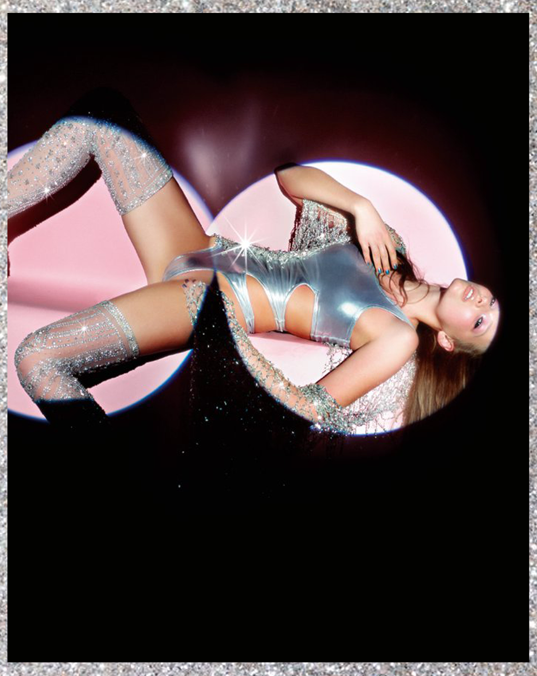
Tiiu Kuik is draped across a centrefold, her body in silver Julian McDonald diamante, her face in peachy pink. Diffused from the top of her cheekbone to her jaw and across her eyelid. The satin sheen on her cheek and jaw intensifies to a glossy one on her lid. There is 360 black kohl in her waterline and blush beige lipgloss. It is 2004.
I picked this shoot, “into the spotlight” Vogue 2004 by Nick Knight and makeup by Val Garland, because of the impact it had on me when I first saw it, at the cusp of teenage. The cover stars Gemma Ward and Lily Cole were both THE girls and to me totally embodied fashion and beauty. But now, refreshing myself, it’s this photo of Tiiu Kuik that stands out to me as having survived the last 18 years the best. Everything about this look feels extremely current again, it looks like a transplant from 2022.
In another shot Tiiu is joined by Polina Kouklina, both in embellished black gold and bronze. The skin is transparent, you can see the heat in Polina‘s face. natural pink touching her chin as well as her jawline (reminder to touch the blush brush under the chin to mirror this endorphin flush) Tawny shades across both lips. The eyes have the same smudgy kohl rims, on Tiiu it’s a warm chocolate brought up from the outer corner of her eye to the brow, both dusted liberally with champagne and soft gold glitter. If this look sounds harsh, it isn’t. It’s prevented from being so by the delicate underpinning of the see-through skin; the undefined brow, a few shades lighter than the hair; and the soft smudgy boundaries.
___STEADY_PAYWALL___
On the cover Lily Cole and Gemma Ward lock gaze directly with you. Their eyes are both a little raw and pink. This could literally be from the yellow spotlight they are both looking up into, the irritation of a few makeup changes, or it could be a sweep of blush around the socket. Either way the slight wateryness is perfect. It give them the impression of having been caught on flash in a club during a genuine party. Lily’s slightly confronting turn to camera does the same. Both models skin is baby soft and unstructured with a slight shimmer that looks like it’s fallen not placed. Gemma’s lip is raspberry metallic, outlined, Lily’s coral red, both the only element of colour, detail and glamour contrasting their fresh faces.
Another shot shows Lily in the same smooth skin with a hint of darkness visible under her eyes and a touch of colour across her cheeks and nose bridge. Emerald green drenched across her eye, up to and encompassing her brow, one shade but varying intensities. The edges are gauzy, undefined. Small hits of white gold glitter gleam at her brow bone and her inner and outer corners. Her bottom lashes and eyeline are bare. Her lips are transparent pink, angular and sitting on her natural lip, not the rounded out overline that’s synonymous with now.
When I see Y2K looks being recreated online This fresh imprecise delicacy is what they are missing. They’ve passed through the 2016 yassify filter that’s left its mark on the aesthetics of everything since. The brows are too sharp, the eyeliner is too clean, every lip is lined, skin is set. I love these 2004 looks because the decadence sets on top of an element of rawness. They have personality.
I think the thing that the youtube era taught us is that sharper and cleaner is always the goal, something we now can’t unlearn even as the trends have moved on. An eyebrow with hairs that lay where they grow is not properly finished. But it’s these details that give the naughties party princess her lightness and lack of concern.
“It wasn’t a detached appreciation of the makeup looks or the clothes, but the fantasy idea of the models and that this shoot was somehow capturing rather than creating them.”
I talk a lot about makeup that looks like the Model has done it herself. That maybe sounds reductive when talking about these masterful looks by Val Garland. Maybe what I really mean are looks that are at home in the situation. That are a believable part of the narrative, rather than a reference to the technicality. What I love is that you cannot see the invisible hand of the people standing behind the camera. They look like they belong to the models rather than having been done on top of them. When this is done right the shoot becomes an immersive experience and the models themselves make an impact as personalities. I was watching a show recently that was really good until one scene when it was clear the actor was wearing a wig and it just took me out of it straight away. I think even in the heightened, stylised world of fashion editorial, you should still be able to buy into that world for that minute no matter how visually insane it is.
I think that’s partly why I loved this shoot so much in 2004 and I still remember getting it in the post with my vogue subscription. It wasn’t a detached appreciation of the makeup looks or the clothes, but the fantasy idea of the models and that this shoot was somehow capturing rather than creating them, especially that cover shot of Lily and Gemma not making much sense in physical space (are they lying down? What about the shadows?) but looking up and the camera, relaxed and totally IT girly that blew my mind.
Words: Grace Ellington


